Points of interest
An information kiosk is a member of staff that never clocks out, never loses patience, and gives the same answer at midnight that it gave at noon — but only if the people responsible for it treat it that way. This guide covers the hardware that makes self-service wayfinding possible: the physical forms, where they go, and what keeps them worth consulting. It is written for the facilities managers, visitor-experience leads, and operations teams who decide what gets installed and who owns it afterward.
The Job a Kiosk Is Actually Hired to Do
Every information kiosk exists to absorb a specific category of question: the one a stranger asks the nearest person with a name badge. Where is the nearest restroom? Which floor is the admissions office on? Is there parking validation? These questions are not complicated, but they are constant, and they pull staff away from work that requires judgment. A kiosk succeeds when a visitor gets a confident answer in under thirty seconds without involving another human. It fails, quietly and completely, when people walk past it without looking up.
The hardware is, in this sense, infrastructure in service of signage that happens to be interactive. Static signs tell people where to go; a kiosk can tell them why, what to expect when they get there, and what to do if their situation does not match the standard path. The distinction matters when designing a deployment: the kiosk is not replacing the sign, it is answering the questions the sign cannot.
A kiosk that goes unused is not a neutral outcome. It occupies floor space, it implies that the organization tried and did not follow through, and it conditions visitors to ignore the next one. The hardware choices — screen size, mounting height, interface depth — shape whether the unit reads as an invitation or as furniture. That framing should drive every specification decision.
Hardware Families and What Each One Is Good At
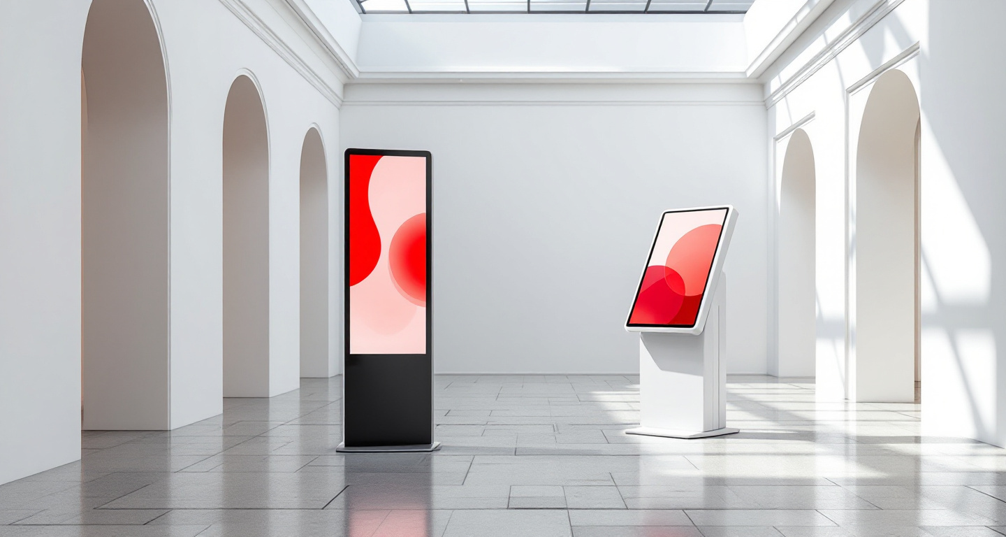
Upright floor totems are the dominant form for high-traffic open spaces. Standing roughly chest-to-eye height, they are visible from a distance and present a large enough screen to display maps, directories, and multi-step navigation without forcing the user to lean in. Their footprint is small relative to their presence, and they can be repositioned without structural work, which makes them the default choice for lobbies, atriums, and concourses where layout changes over time.
Angled-top information stands lower the screen to a reading angle and are well suited to contexts where users are expected to spend a moment consulting rather than glancing — ticketing areas, check-in queues, and anywhere a person is already stationary. Wall directories mount flush to a surface and work where floor space is genuinely constrained: elevator lobbies, corridor intersections, and the side walls of entrances where a totem would obstruct foot traffic. Tablet stations on counters or pedestals serve transactional use cases: form intake, check-in confirmation, appointment scheduling. Portable units — wheeled enclosures designed for temporary deployment — serve events, seasonal changes in layout, and situations where the permanent configuration cannot be altered.
Where You Put It Is What It Does
Placement determines whether a kiosk gets used far more reliably than screen size or interface design. The governing principle is simple: a kiosk belongs at the moment of uncertainty, not at the moment of arrival. Entrances matter, but the more useful positions are junctions — the points where a corridor splits, where a visitor must choose a direction, where the next step is not obvious. Elevator lobbies are consistently underused as kiosk locations despite being exactly where people pause and look around.
Sightlines compound placement. A unit that requires a visitor to notice it, walk toward it, and then reorient to use it has already asked too much. The screen face should align with the direction of natural pedestrian approach, so a person in motion can read it without breaking stride to decide whether it is relevant to them. Units placed perpendicular to foot traffic, tucked into alcoves, or positioned behind columns get ignored regardless of content quality.
The gap between where planners want kiosks and where lost people actually stop is a real and recurring problem. Planners tend to optimize for aesthetics and traffic flow symmetry; lost people stop at the nearest landmark after they realize they are lost, which is usually not at the entrance where the kiosk was placed. A brief observation session — watching where visitors pause and look uncertain — will consistently reveal placement opportunities that a floor plan review misses entirely.
The Trust Loop and What Breaks It
A visitor uses an information kiosk exactly as many times as it is right, plus once. The first wrong answer — the room that moved, the department that relocated six months ago, the event that was cancelled — ends that visitor's relationship with the unit and, in many cases, with any similar unit in the same facility. This is not an exaggeration; it is the ordinary psychology of a tool that presents itself as authoritative. The kiosk does not say "this might be out of date." It presents information as fact, and visitors treat it that way until it betrays them.
Data ownership is the upstream problem. When nobody is clearly responsible for the accuracy of what the kiosk displays, updates happen inconsistently — after a renovation, perhaps, but not after a department moves to a temporary space, not after an event is rescheduled, not after the accessible entrance is closed for maintenance. The question "who updates this when something changes?" needs a named answer before hardware is selected, not after it is installed.
Update cadence and a brief daily review are the operational habits that sustain trust. The review does not need to be extensive: someone with knowledge of current conditions glances at the displayed information each morning and flags anything that has drifted from reality. This is a two-minute task when it is routine and a crisis when it is not. The kiosks that remain genuinely useful years after installation are almost always the ones where that daily glance became habitual, not the ones with the largest screens or the most sophisticated interfaces.
| 01 | Indoor wayfinding kiosks: the machine at the junction Hospitals, malls, and campuses indoors — universal design, junction placement, glare and queue space, and keeping the map true. |
| 02 | Campus and district wayfinder totems: orientation at outdoor scale You-are-here accuracy, heads-up maps, gateway placement, foundations and trenching, and measuring whether orientation improved. |
| 03 | Tablet stations: the lightest way to answer a question Exhibit labels, sign-ins, and surveys on tablet hardware — stands, lockdown, ten-second sessions, and battery-age realities. |
| 04 | Upright floor kiosks: the workhorse totem indoors The portrait totem — reach rules, attract loops that read from thirty feet, placement posture, and lifecycle economics. |
| 05 | Portable kiosks: information points that travel Event-cycle hardware — road cases, tool-less assembly, offline-first software, and the teardown discipline that saves the next show. |
| 06 | Touch-screen kiosks across public settings What separates a kiosk that survives daily public use from one that degrades — environment, placement, throughput, and software durability. |